
OAK & IRON
VISUAL IDENTITY • WEBSITE • PHOTOGRAPHY • PRINT & DIGITAL DESIGN
Oak & Iron is a custom furniture studio and community-focused storefront in White Bear Lake, Minnesota.
The brand is built around handcrafted live edge furniture, local workshops, heirloom-quality pieces, and a deep connection to the community.
They needed a brand identity that felt warm, established, and rooted in craft while still being polished enough to support
a retail storefront, custom furniture commissions, printed materials, signage, photography, apparel, and a full website.
THE CHALLENGE:
Oak & Iron needed more than a logo. They needed a complete brand system that could tell the story of the business, honor the founder’s roots, and work across a wide range of real-world applications.
The challenge was creating an identity that felt handcrafted and personal without feeling rustic in a generic way. It needed to feel professional, local, timeless, and flexible enough to work on everything from storefront signage and business cards to product tags, event materials, apparel, wood engraving, and the website.
MY ROLE:
I led the creative direction, brand identity design, website design, photography, and supporting brand applications for Oak & Iron.
My role included developing the visual identity from concept to final system, building out the brand’s colors and typography, designing key print and signage pieces, creating realistic mockups, photographing brand assets, and building a website that gave the business a polished home online.
PROJECT SCOPE:
VISUAL identity and logo design
Custom Squarespace website
STOREFRONT & PRODUCT photography
Branded print and digital materials
BRAND SYSTEM
The Oak & Iron brand system was built to feel grounded, handcrafted, and established. Every piece was designed to reflect the warmth of the storefront, the quality of the furniture, and the deeper story behind the name.
LOGO SUITE
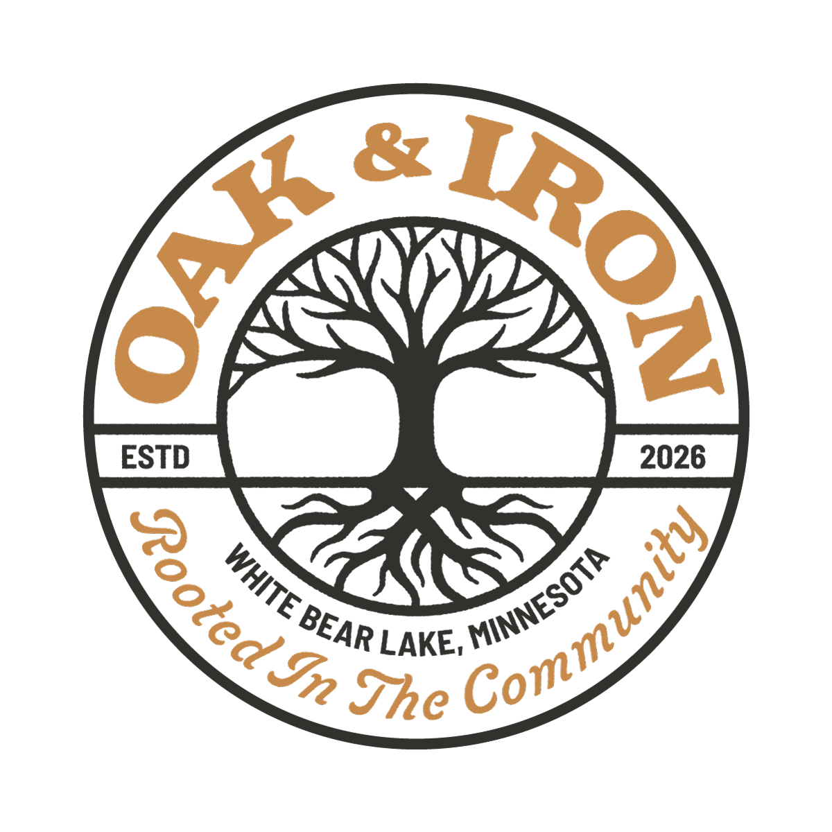
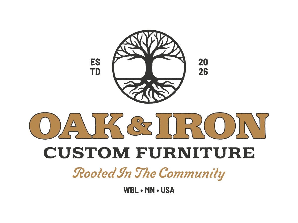
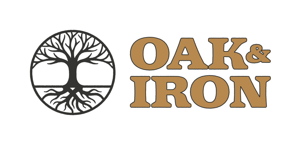
The logo system includes a primary badge, alternate lockups, simplified marks, and one-color versions that can be used across print, digital, signage, apparel, and engraved materials. The main mark features an oak tree with deep roots, subtle generational details, and a strong circular badge structure that gives the identity a timeless, crafted feel.



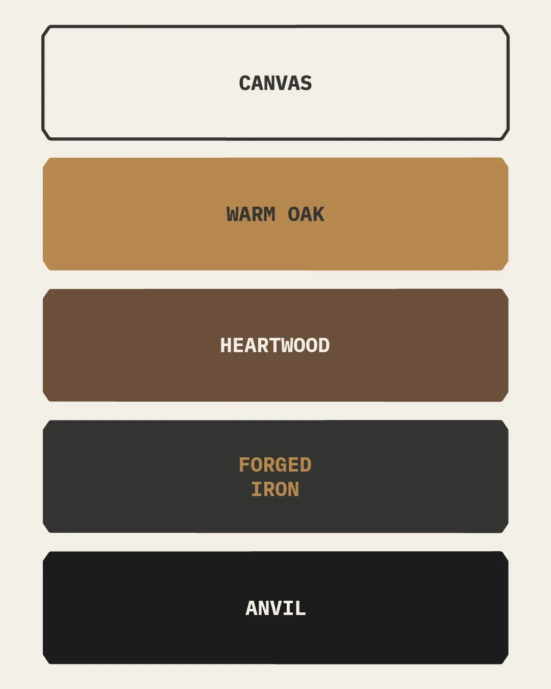
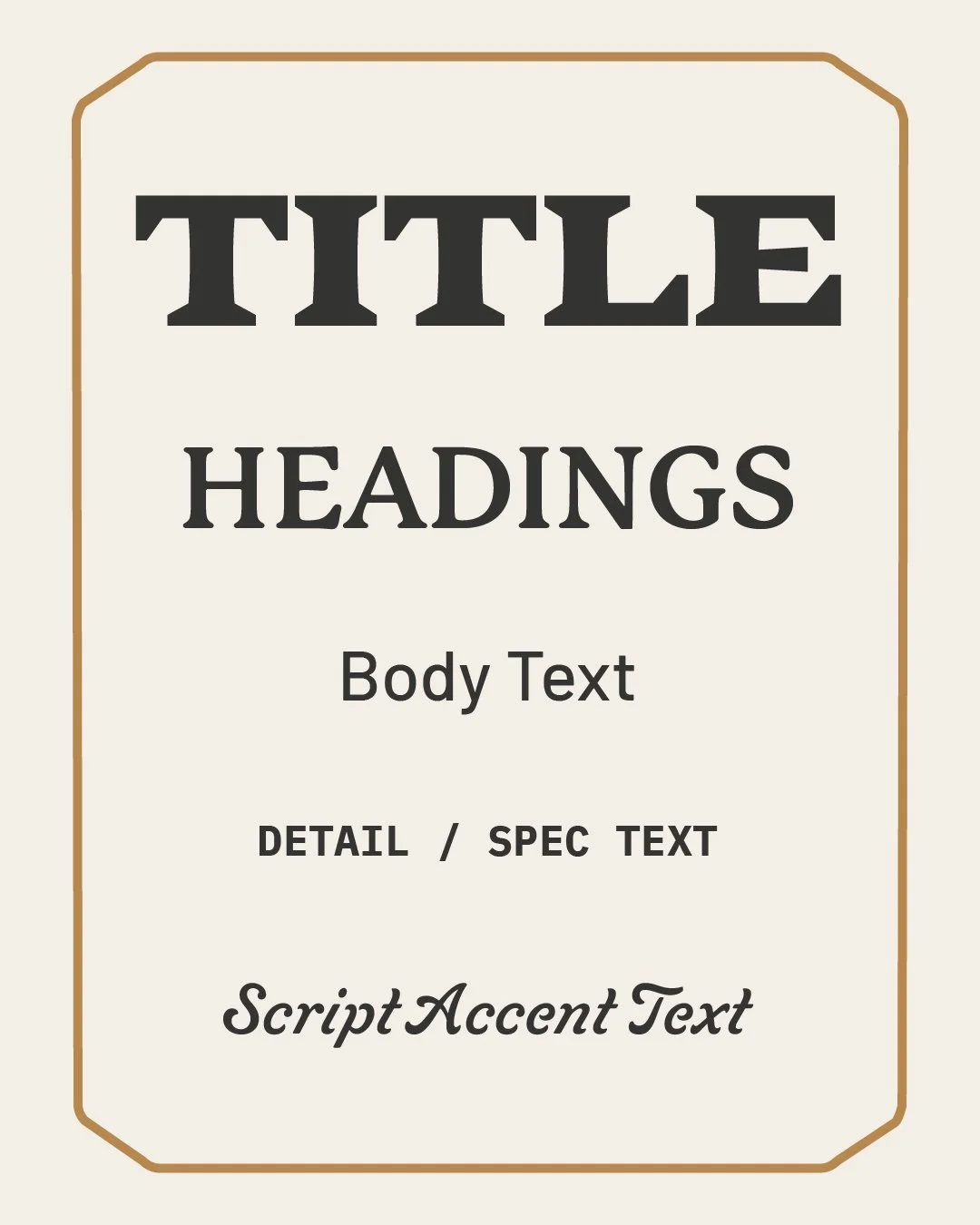
COLOR PALETTE & TYPOGRAPHY
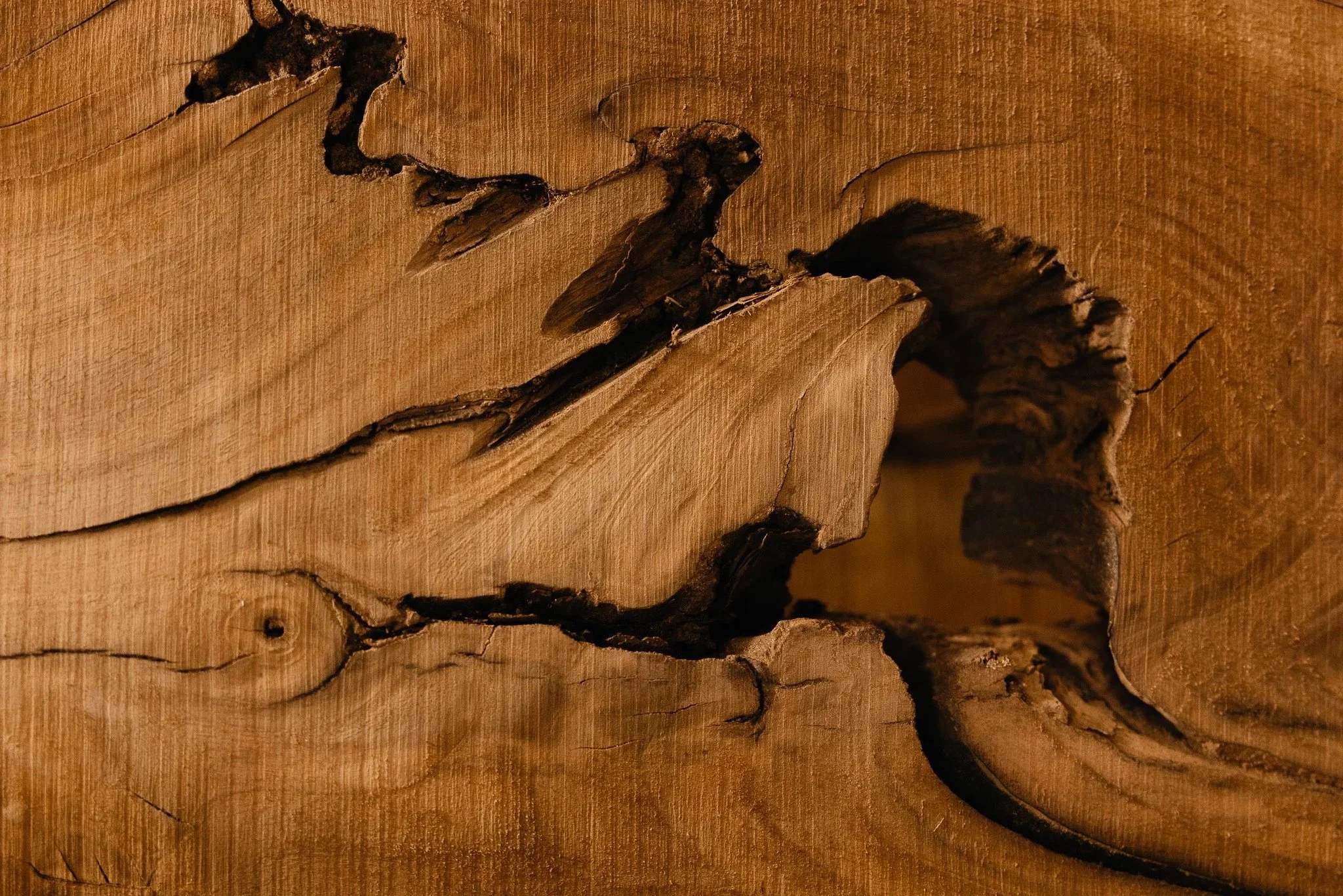
The color palette was inspired by natural materials and workshop tones.
Together, the colors create a warm, durable, and refined foundation for the brand.
The typography system balances structure, warmth, and character. Strong display type gives the brand a confident presence,
while supporting typefaces keep the system practical, readable, and flexible across the website, print pieces, and signage.
VISUAL DETAILS
Supporting elements, textures, badge layouts, and patterns were created to help the brand feel complete without becoming cluttered.
The system was designed to feel intentional whether it was used on a website, a business card, a product tag, or an engraved piece of wood.


BUILT FOR REAL USE
The brand was designed to work beyond a presentation deck. Oak & Iron needed a system that could hold up in the real world.
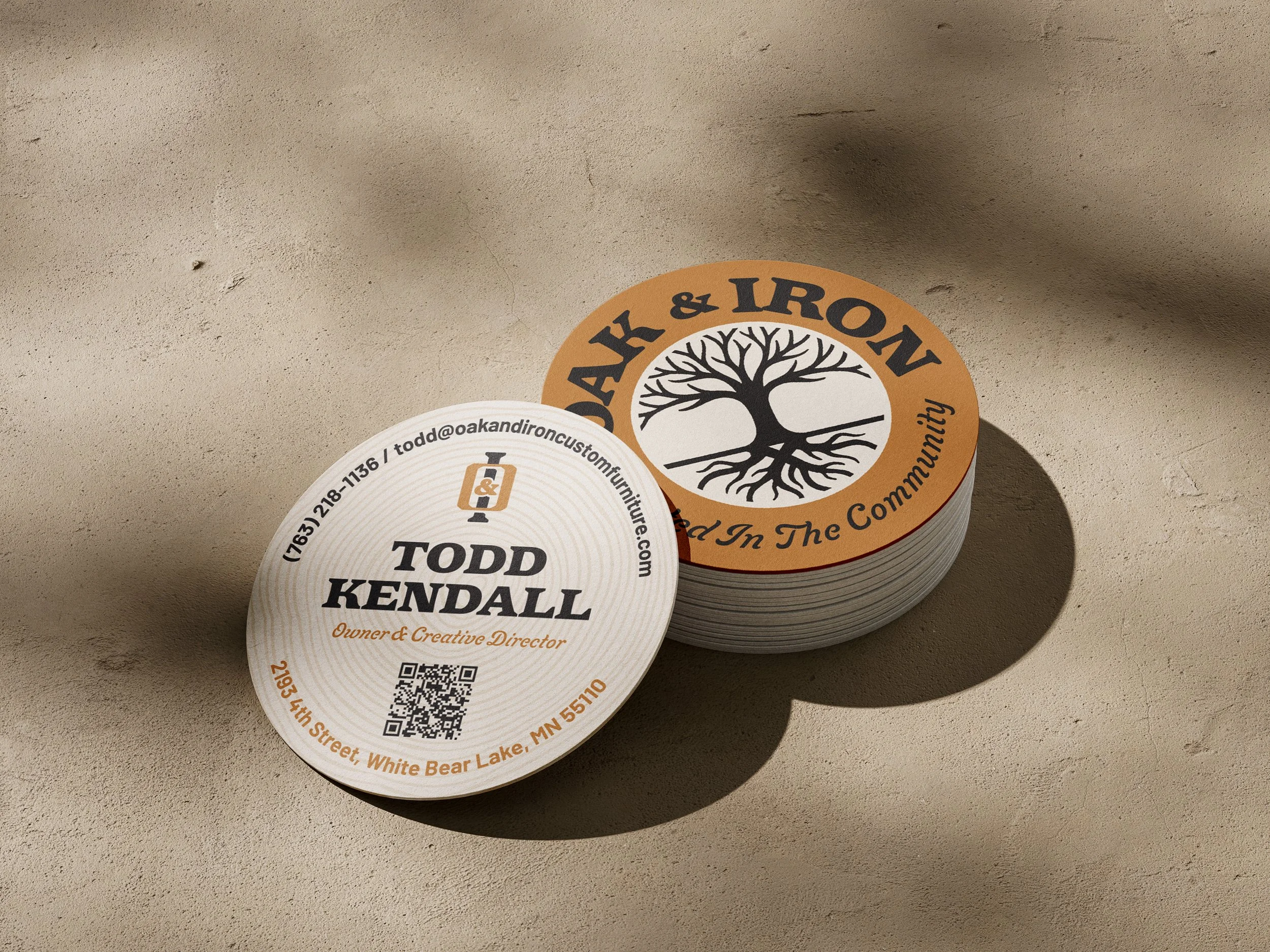
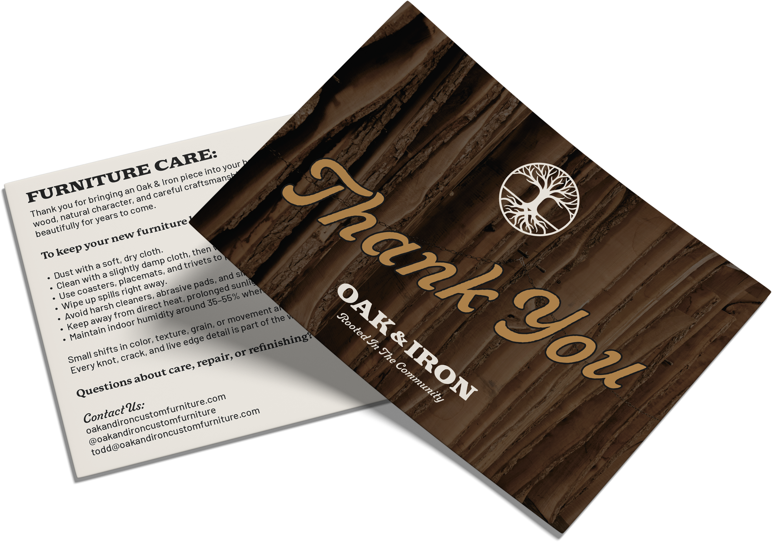
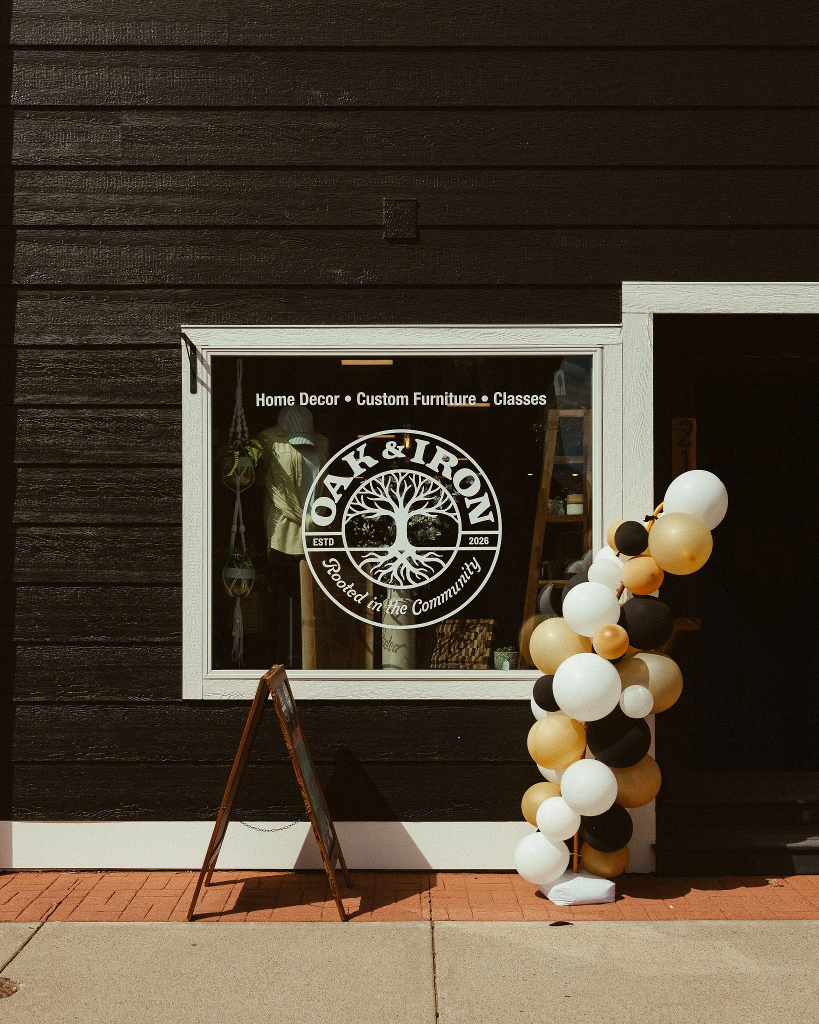
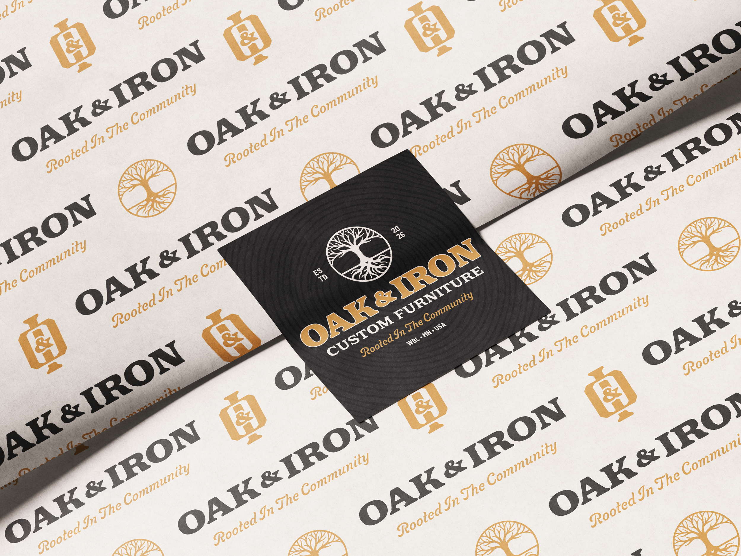
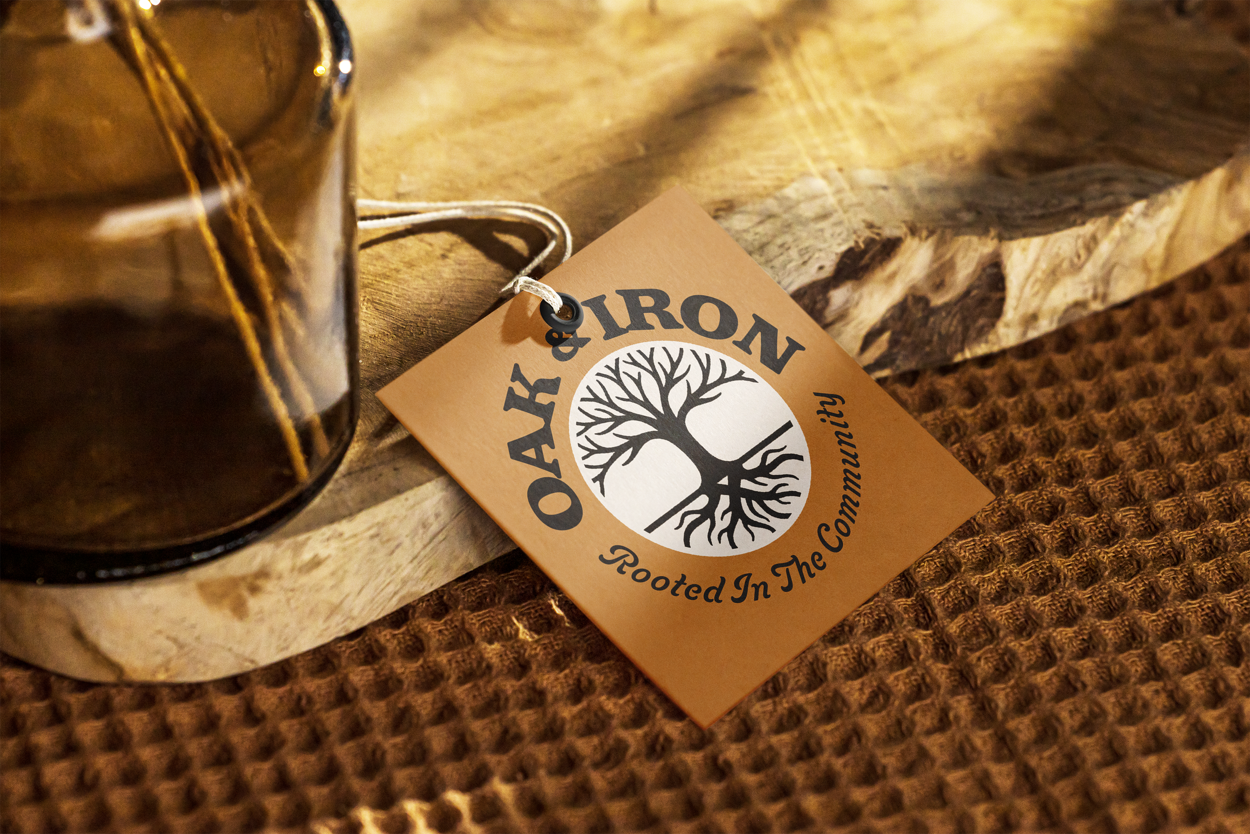
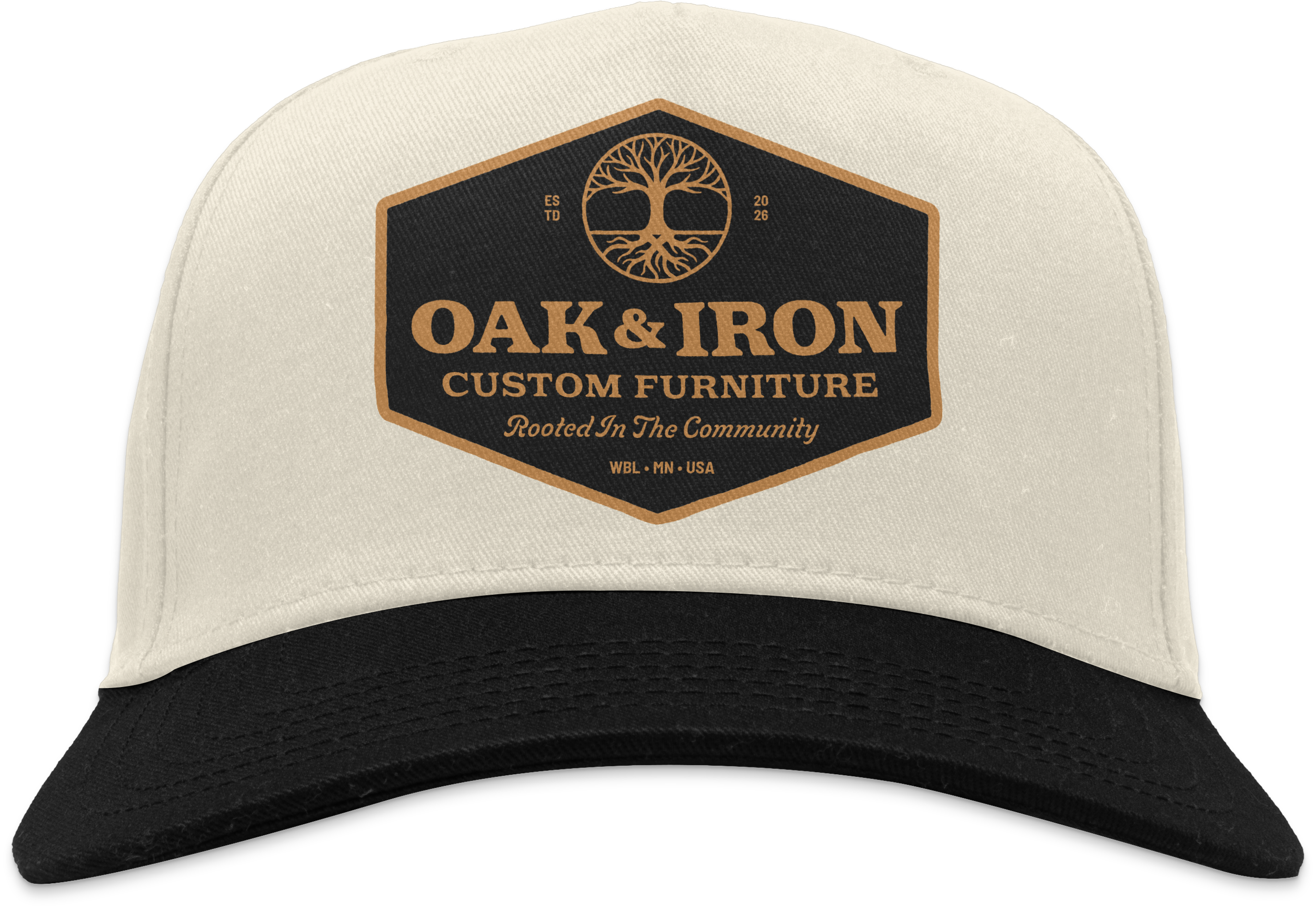
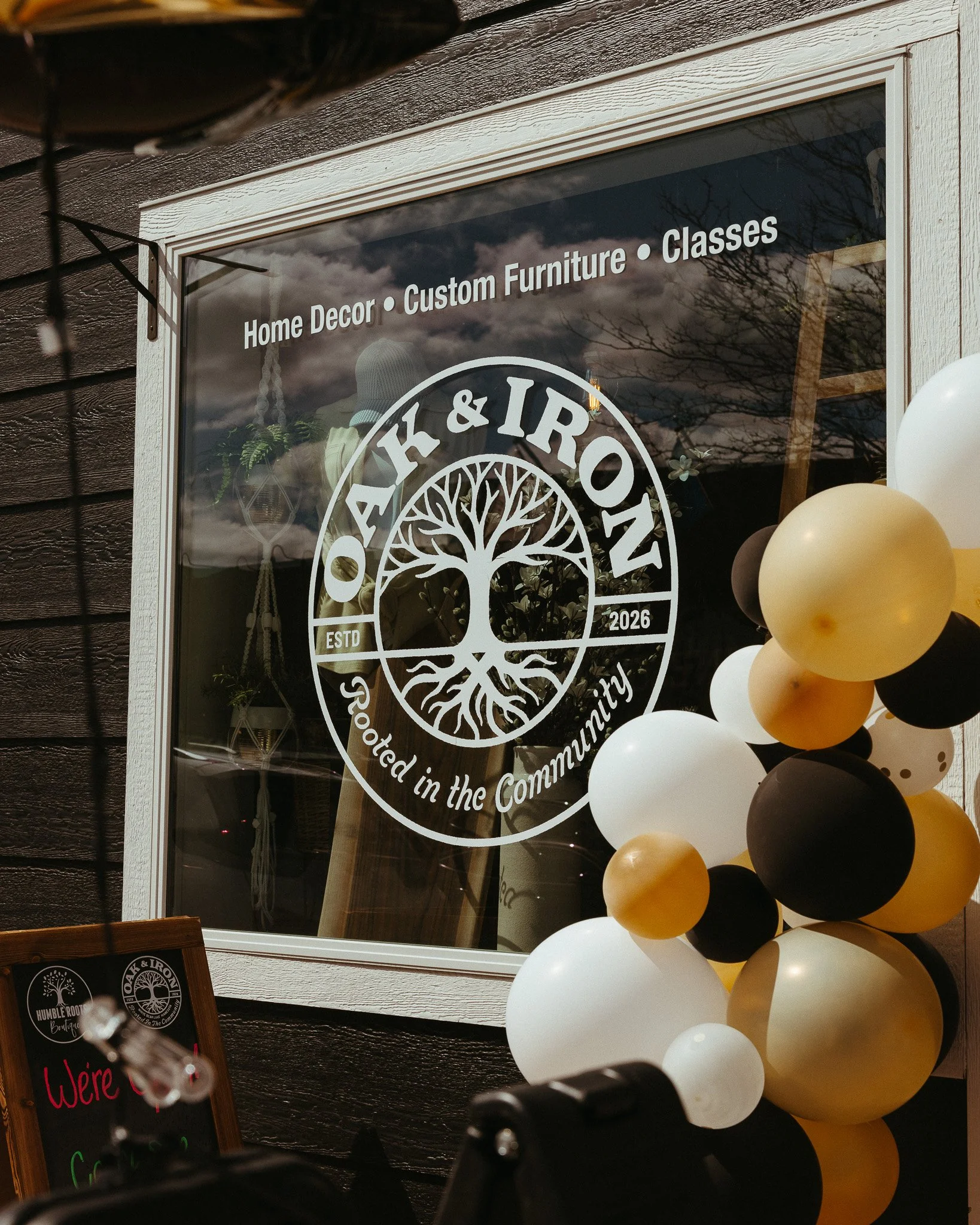
The identity was applied across round business cards, storefront signage, the website, thank you and product care cards, wood engraving, wrapping paper, product price tags, embroidered hats, an A-frame sidewalk sign, stickers, and an event flyer.
Each application was created to feel consistent, useful, and true to the brand.

WEBSITE DESIGN
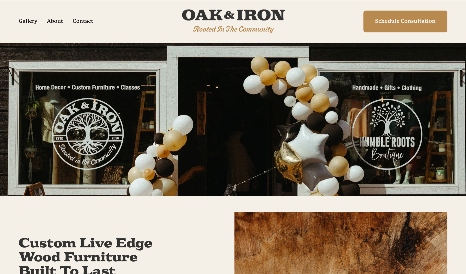
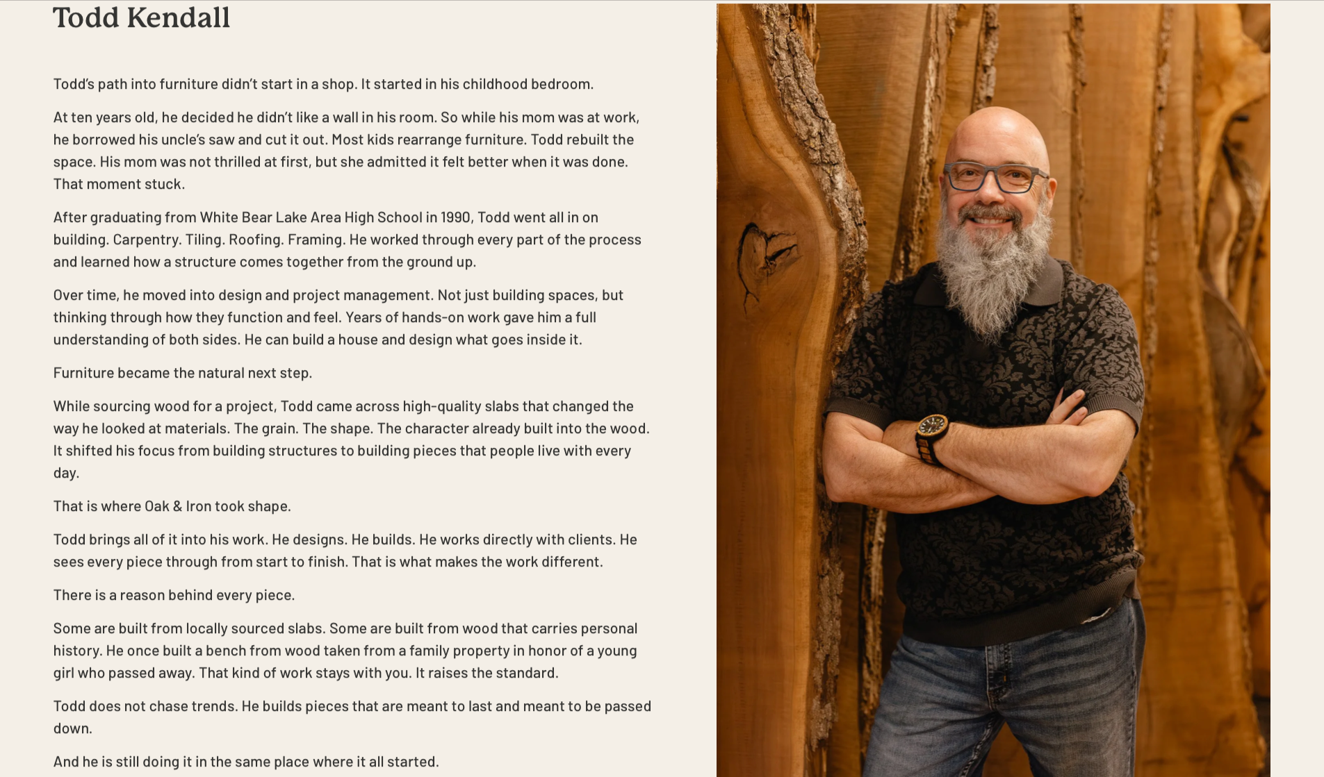
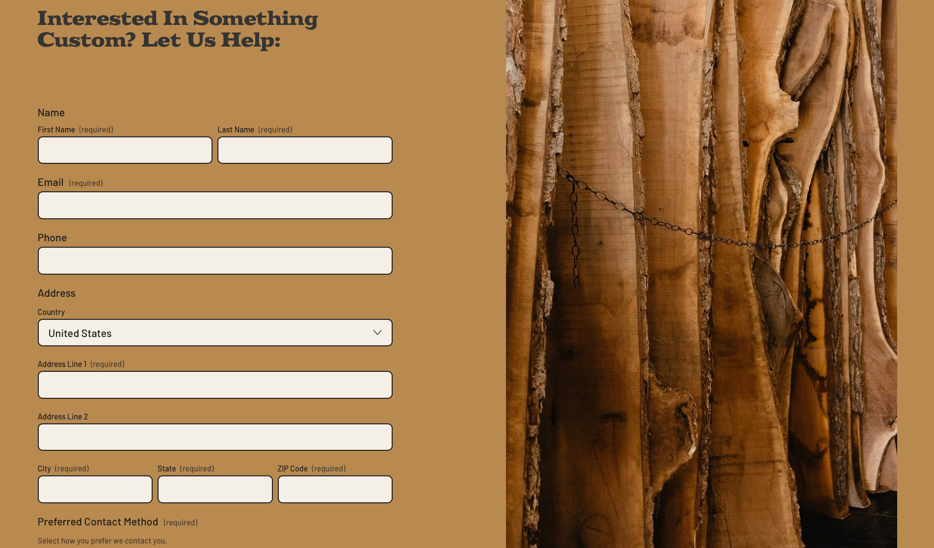
The Oak & Iron website was designed and built to give the business a polished online home. The site needed to introduce the brand, tell the founder story, showcase custom furniture, explain the storefront, promote workshops, and make it easy for people to request a custom quote or get involved.
The website was built to feel warm, clear, and approachable while carrying the same visual language as the rest of the brand system.
PHOTOGRAPHY
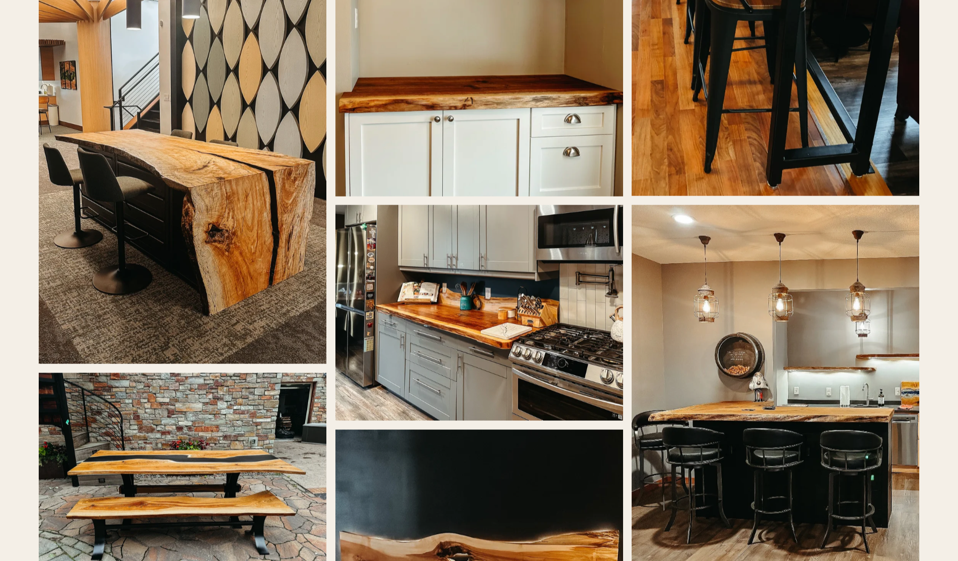
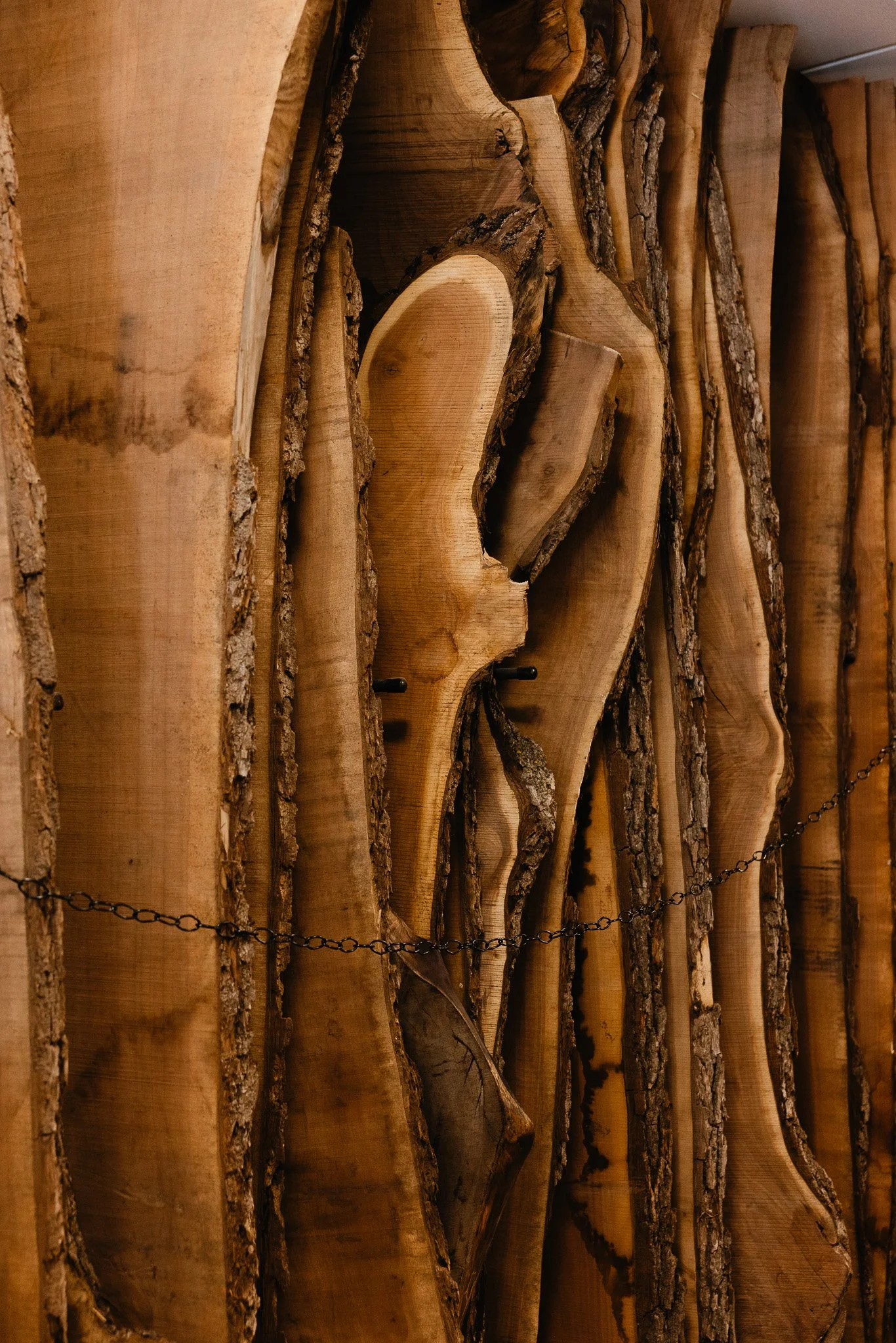
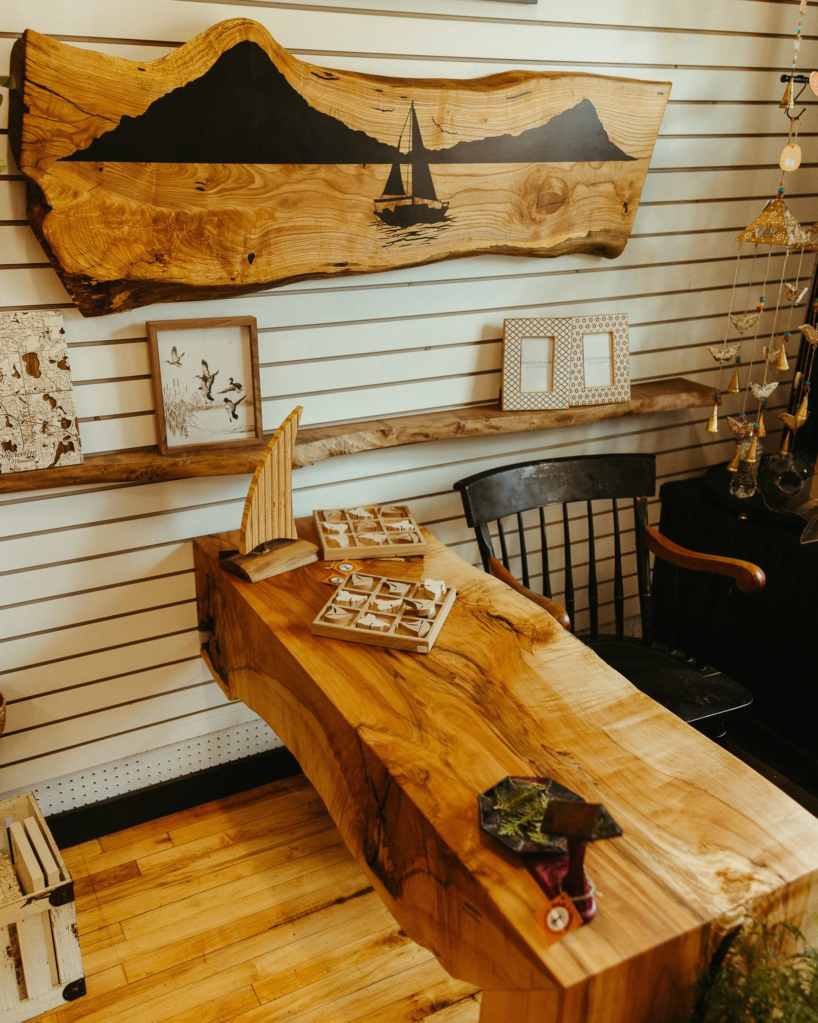
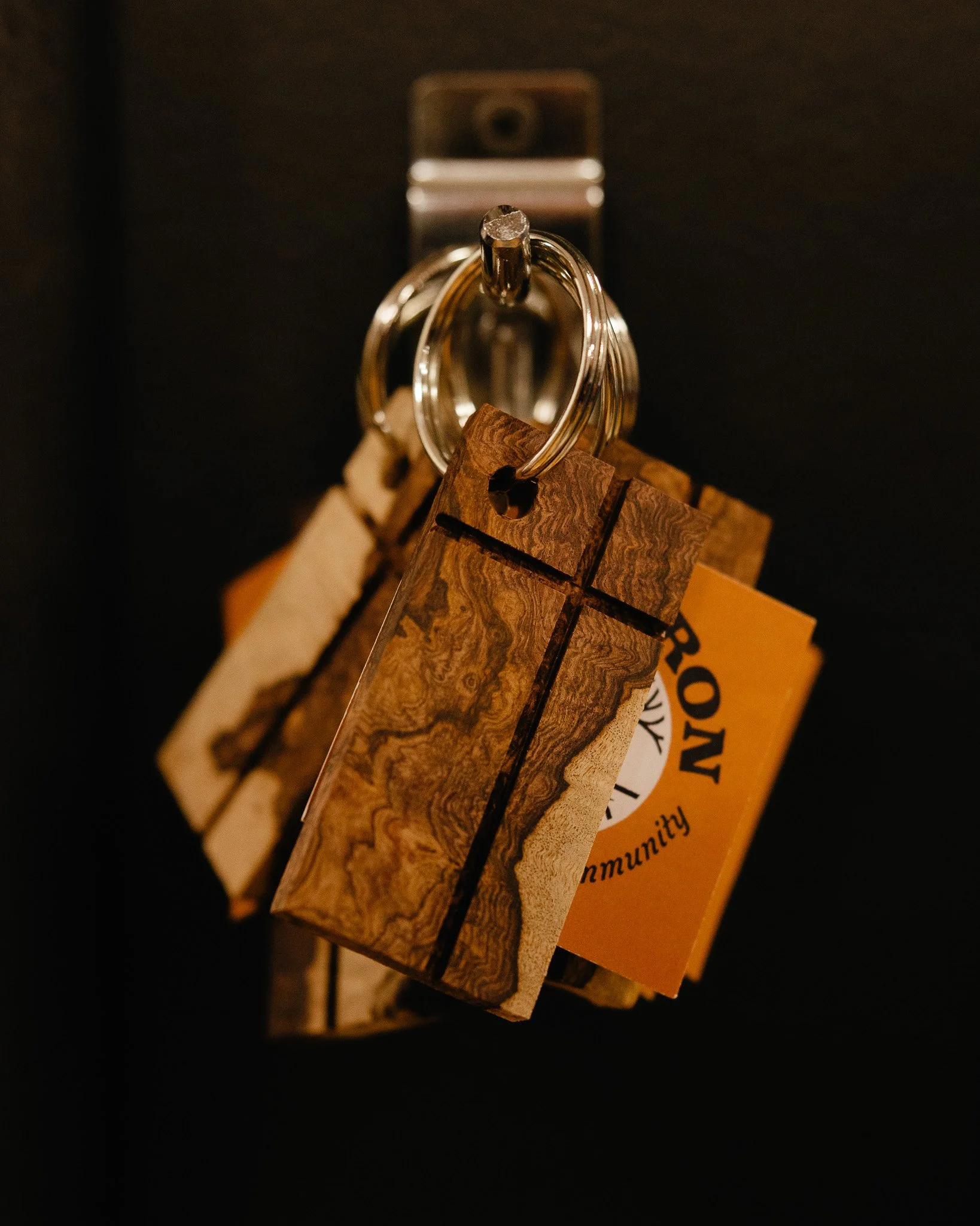
Photography helped bring the brand out of the mockups and into the real world.
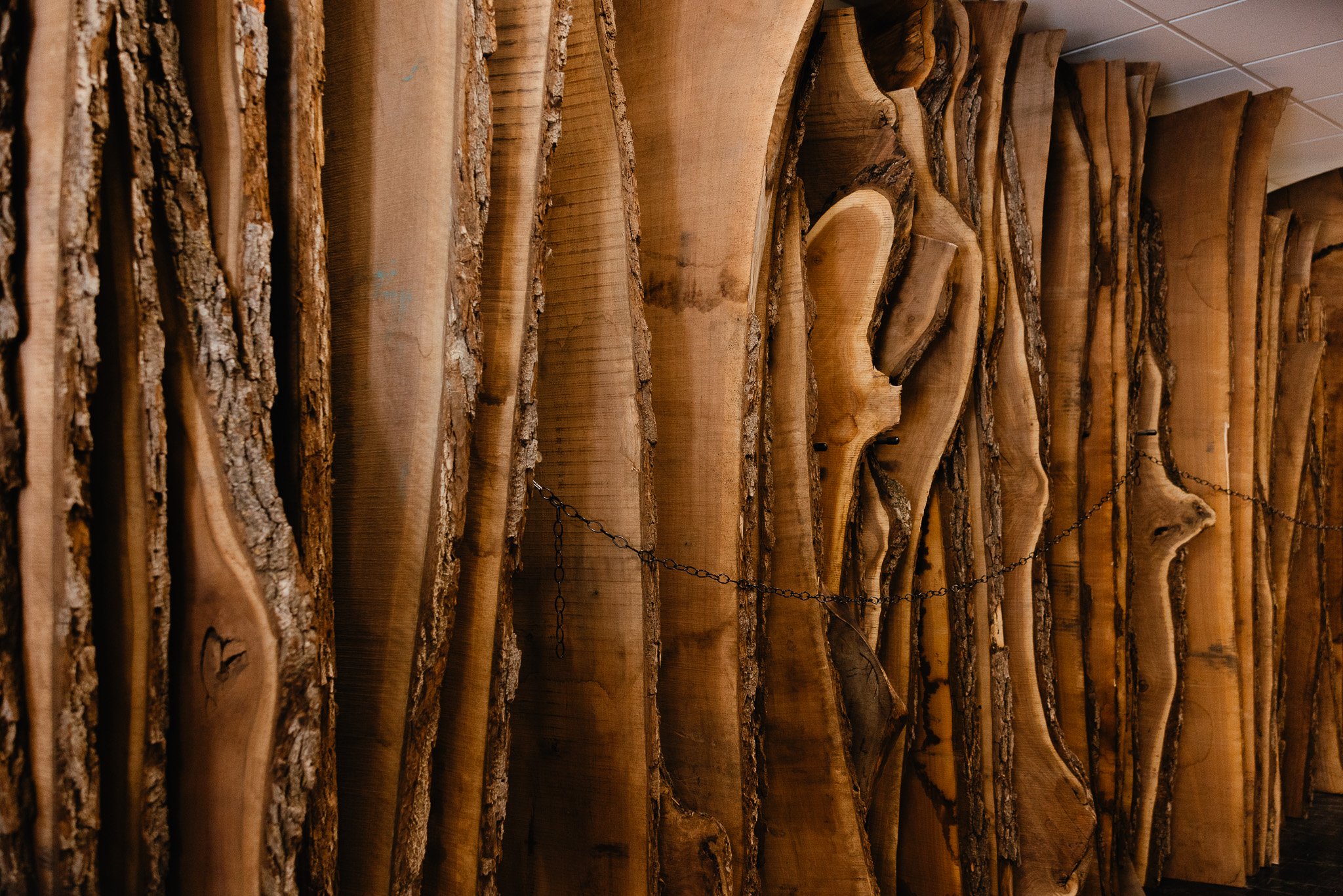
The photo direction focused on the materials, process, storefront, details, and personality behind Oak & Iron.
The images were created to support the website, social content, brand launch, and overall visual presence of the business.
THE RESULT
Oak & Iron now has a complete brand system that feels rooted, flexible, and ready for growth.
The final identity gives the business a strong foundation across digital, print, signage, apparel, photography, workshops, and customer-facing materials. It reflects the heart of the brand: handcrafted furniture, local connection, family roots, and a space built for the community.
A brand rooted in the community. Built with craft. Made to last.
Need a brand that feels as intentional
as the work you do?
Let’s build something with roots.